Original vibe preserved
The moving palms, wave graphics, sun-yellow logo, coral headers, handwritten-style headings, and personal photos are still the identity of the site.
Unofficial coastal guide • beaches, food, wildlife, and personal favorites
This page preserves the original class-project explanation while making it read like a real design rationale: goals, audience, visual language, interaction choices, and source transparency.
Keep the original tropical chaos, but make the site more useful and credible.
The moving palms, wave graphics, sun-yellow logo, coral headers, handwritten-style headings, and personal photos are still the identity of the site.
The upgrade adds deeper content, better page hierarchy, stronger forms, responsive grids, clearer CTAs, official-resource links, and transparent unofficial-guide framing.
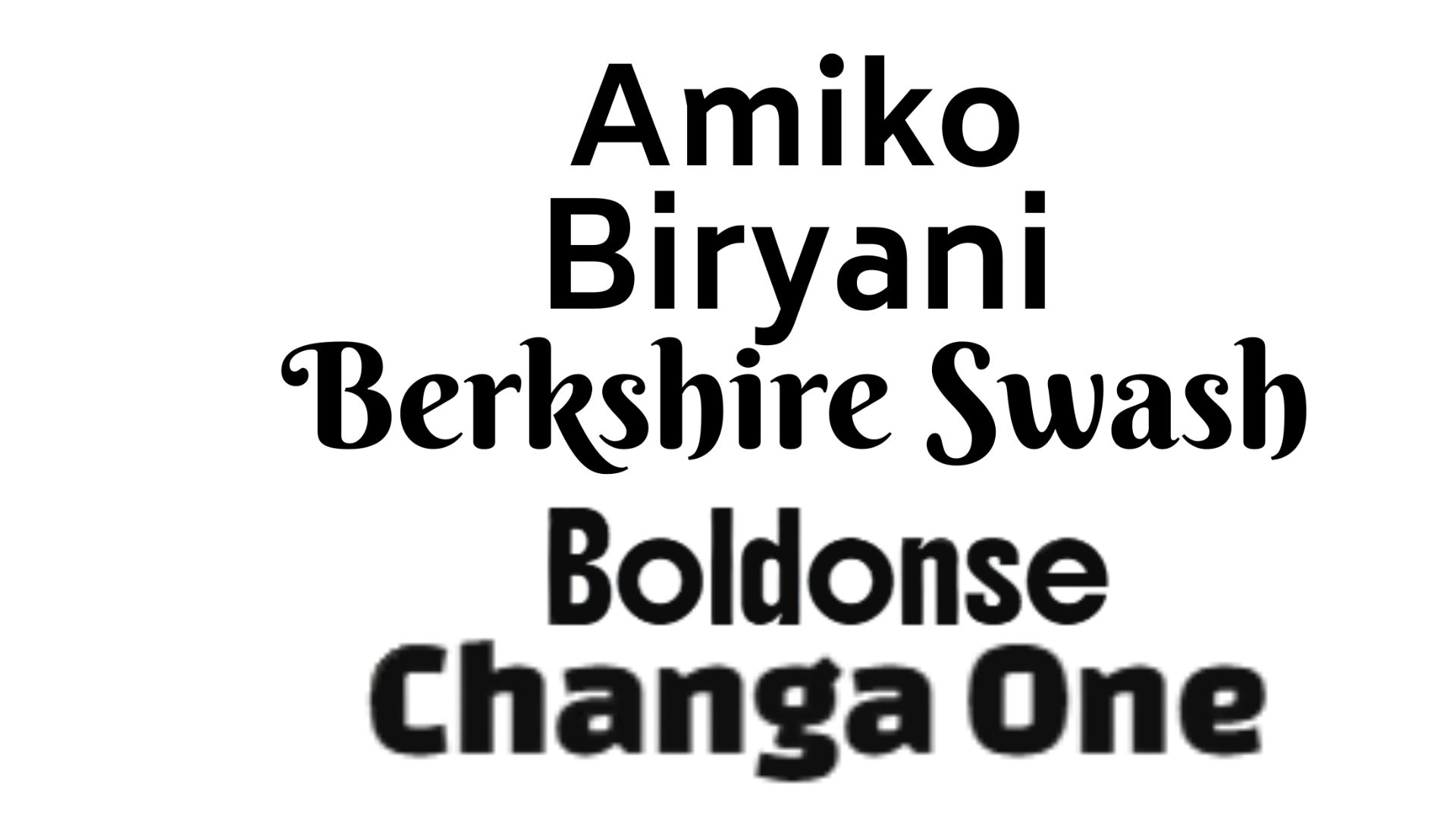
Berkshire Swash keeps the coastal handwritten personality. Changa One gives page titles a bold vacation-poster feeling. Amiko keeps longer guide content readable so the site can carry more detail without becoming exhausting.
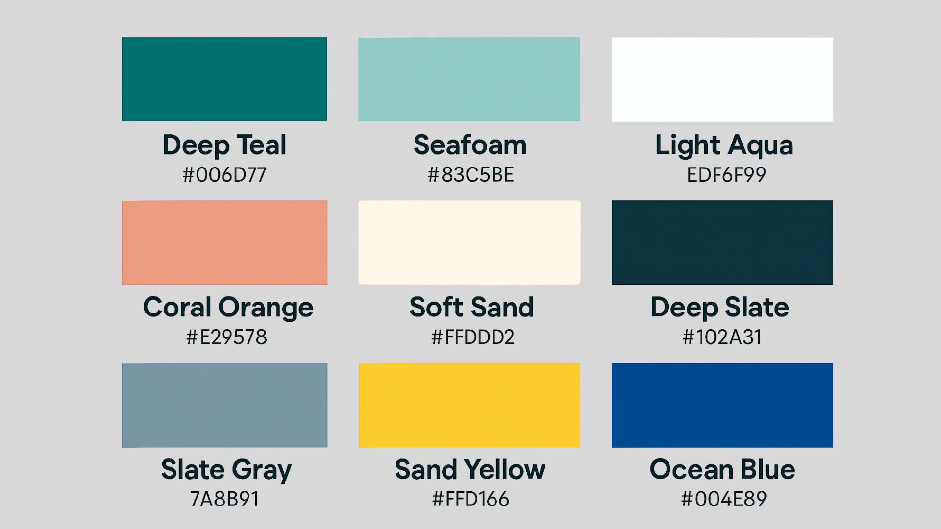
The color system still uses beach references, but now it has roles.
#006D77 for trust, navigation, dividers, and structure.
#E29578 for tropical energy, highlights, buttons, and card accents.
#FFD166 for logo energy, emphasis, and playful CTA contrast.
#83C5BE for background atmosphere and softer supporting panels.
#EDF6F9 for the main page surface and calm reading space.
#102A31 for footer, contrast, and body text strength.
The site is no longer only “three things to do” and “three places to eat.” Each page now answers what a visitor actually needs: what to choose, when to do it, what to check, how to plan, and where the official resources are.
The project uses original/personal images supplied in the build plus public official resources for visitor context.